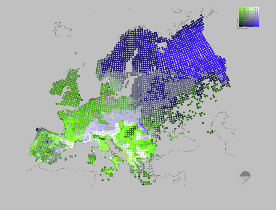
Increasing intensity of blue is used to represent increasing native species and subspecies richness of Pinaceae and intensity of green is used for native species and subspecies richness of Fagaceae. Consequently, black grid cells on the map show low richness for both; white shows high richness for both; and shades of grey show intermediate and covarying richness for both (these covarying scores lie on the diagonal of the colour key, to the upper right of the map). In contrast, areas of the map with highly saturated blue cells show an excess of richness for Pinaceae over Fagaceae, and areas with highly saturated green show an excess of Fagaceae over Pinaceae (Spearman correlation coefficient rho= -0.33). The colour classes are arranged to give even frequency distributions of richness scores along both axes (at least within the constraints imposed by tied richness scores), and occupied colour classes of the colour key are shown by grey spots (below):
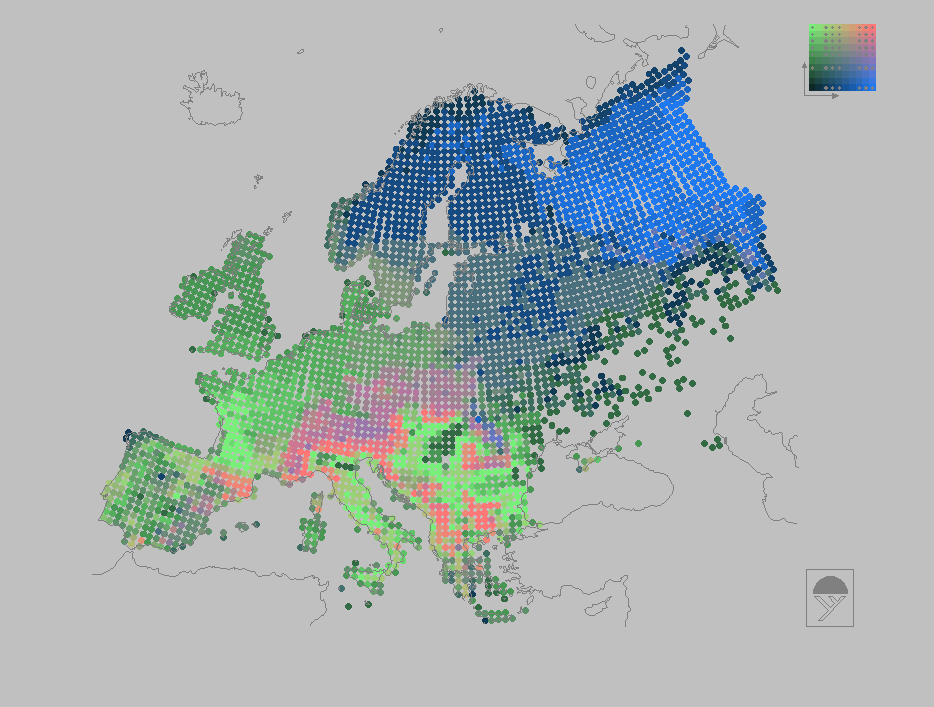
A slightly modified version of the same plot is shown below, in which red is used in place of white for grid cells with high richness for both Pinaceae and Fagaceae (cf. colour-scale boxes at the top right of each map) (below):
![]()